Reports: graph of ongoing offsite use #32
Description
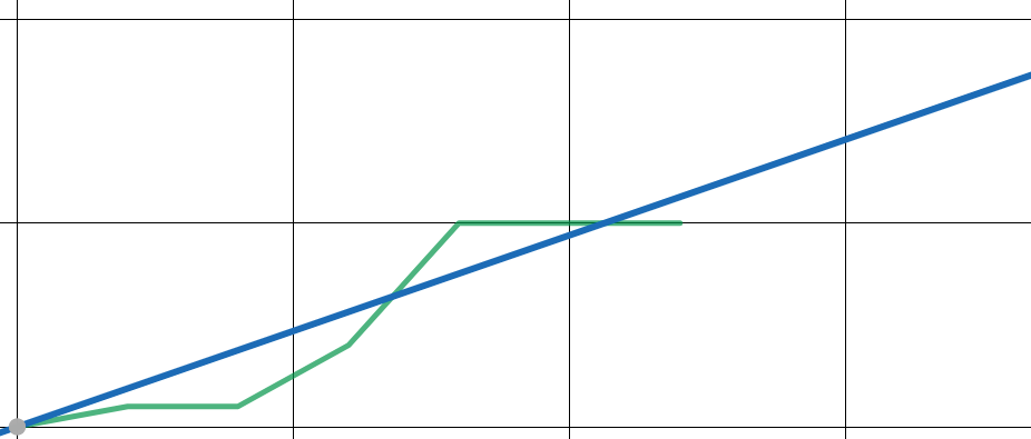
I have a dream that, using a tool like chart.js, we provide on the view reports page a visualization of total offsite use to date. Something like this, where the blue line represents "sustainable" usage of time throughout the year, and the green line is the student's actual YTD cumulative usage. You can see when you got "off track," when you got back "on track," etc.
I've written a function that takes a student id and outputs an array of dates and cumulative offsite usage that could be fed to chart.js.
function offsiteTable($student_id) { // returns an array with timestamps as key and running total of offsite elapsed
  global $db;
  $student_events = $db->query("SELECT timestamp,elapsed,status_id FROM history WHERE student_id = '$student_id' ORDER BY event_id ASC")->fetch_all($resulttype = MYSQLI_ASSOC);
  $student_events = array_filter($student_events,"countsAsOffsite");
  $events = array();
  $running_total = 0;
  foreach ($student_events as $student_event) {
    $key = $student_event['timestamp'];
    $running_total += $student_event['elapsed'];
    $events[$key] = $running_total;
  }
  return $events;
}

function countsAsOffsite($event) { // returns true if an event counts as offsite
  return !($event['status_id'] == 1 || $event['status_id'] == 3 || $event['status_id'] == 6);
}
Possible improvements to be made by whoever takes this on:
- In constructing the array, discard/collapse any events that appear on the same day, so there is at most one point on the graph for each calendar day
- Also discard any days from the array that don't include a (significant?) change in offsite use
Metadata
Metadata
Assignees
Labels
No labels