Discover the greatest films of all time. Skip a few. Track your progress.
Each decade since 1952, the British Film Institute's Sight & Sound Magazine has been putting out a carefully compiled list of the greatest films of all time. The published lists are usually 10 titles long, but in 2012 they put out a whopping 250 titles.
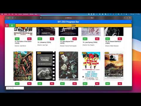
I created the BFI 250 Progress Bar as a way to track my progress through this list. Two important features for me:
- A button to "Skip" films I don't intend to see
- A visually simple progress bar
- Mobile-friendly
- HTML
- CSS
- Javascript
- Bootstrap
- React
- Redux
- react-router-dom
As of January 2021, the front end is fairly mature, but it saves all data to local storage. I am now working on backend integration in order to allow authentication to preserve viewing status across devices.

const MovieCard = (props) => {
  let seenStatus = {};
  const pulledSeenStatus = useSelector((state) => state.seenStatus.seenStatus);
  if (pulledSeenStatus) {
    seenStatus = pulledSeenStatus;
  }
  let imdbLink = 'https://www.imdb.com/title/' + props.imdbID + '/';
  return (
    <div className='card card-group' style={{ width: '18rem' }}>
      <div className='poster'>
        <Badge seenStatus={seenStatus[props.imdbID]} />
        <a href={imdbLink} target='_blank' rel='noreferrer'>
          <img
            src={props.poster}
            style={{ height: '400px' }}
            className='card-img-top'
            alt={props.title}
          />
        </a>
        <div className='card-body align-self-end'>
          <div className='button-container view-status-buttons align-self-end'>
            <CardButtons
              seenStatus={seenStatus[props.imdbID]}
              id={props.imdbID}
            />
          </div>
        </div>
      </div>
      <div className='card-body'>
        <h5 className='card-title'>
          {props.bfiRank}. {props.title} ({props.year})
        </h5>
        <p className='card-text'>Director: {props.director}</p>
      </div>
    </div>
  );
};
MIT © Elijah Wilcott