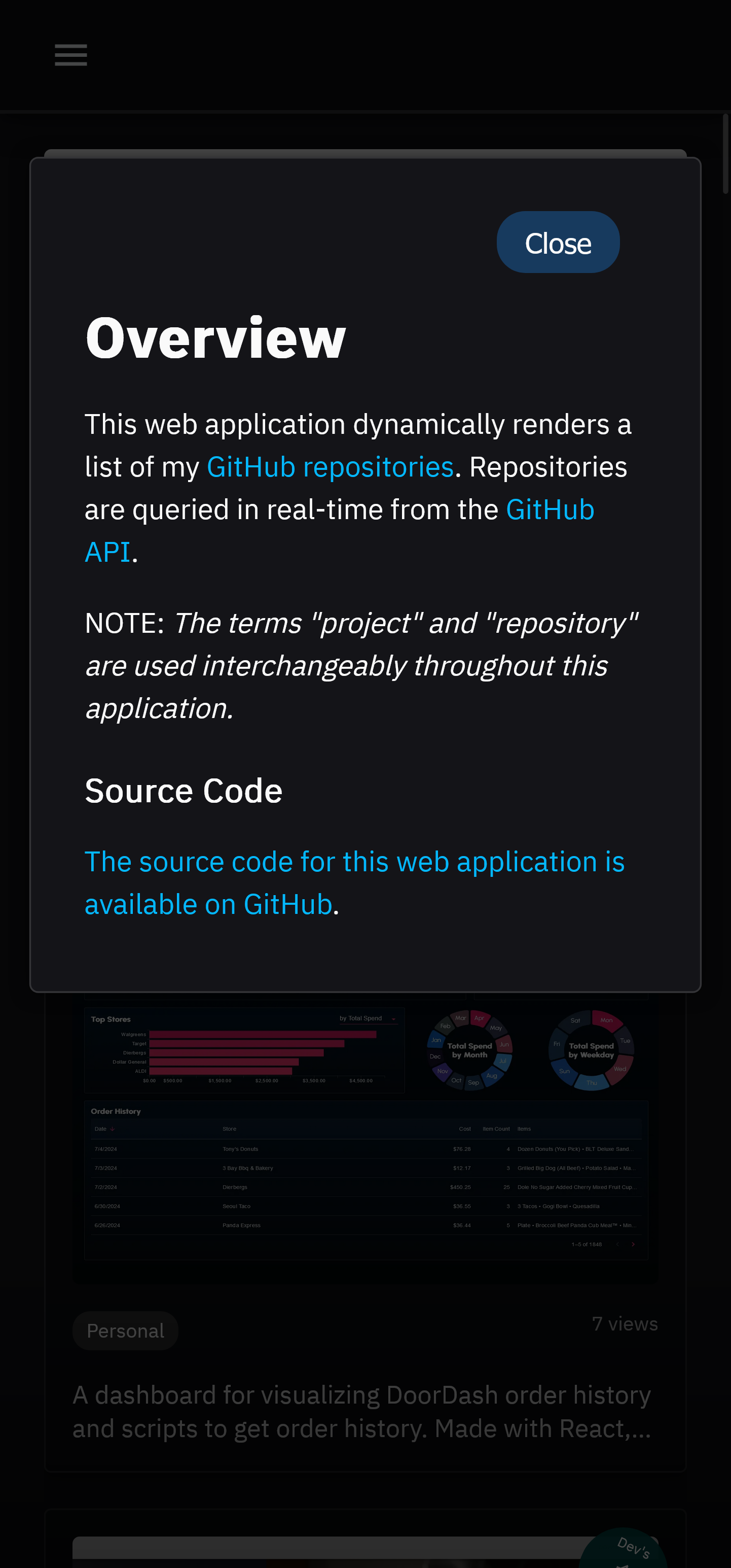
What began as a case study to demonstrate role alignment now functions as a project dashboard.
NOTE: The terms "project" and "repository" are used interchangeably throughout this document.

- React
- TypeScript
- JavaScript
- HTML
- CSS
- Tanstack React Query
- MUI X Charts
- react-intersection-observer
- GitHub API
- Vite
- Axios
At my first tech job, I wanted to move laterally within the company from "Data Engineer" to "Software Engineer". I had to convince upper management I was qualified for the change. Given I had related work on my GitHub, I saw an opportunity to strengthen my argument by summarizing my GitHub content.
The main point I wanted to make was that my experience and skill-set aligned more with the role of Software Engineer than that of Data Engineer. To that end, this dashboard was originally designed to compare quantities of work related to each role. For example, the dashboard displays the number of projects relating to web development or the number of projects using JavaScript, etc.
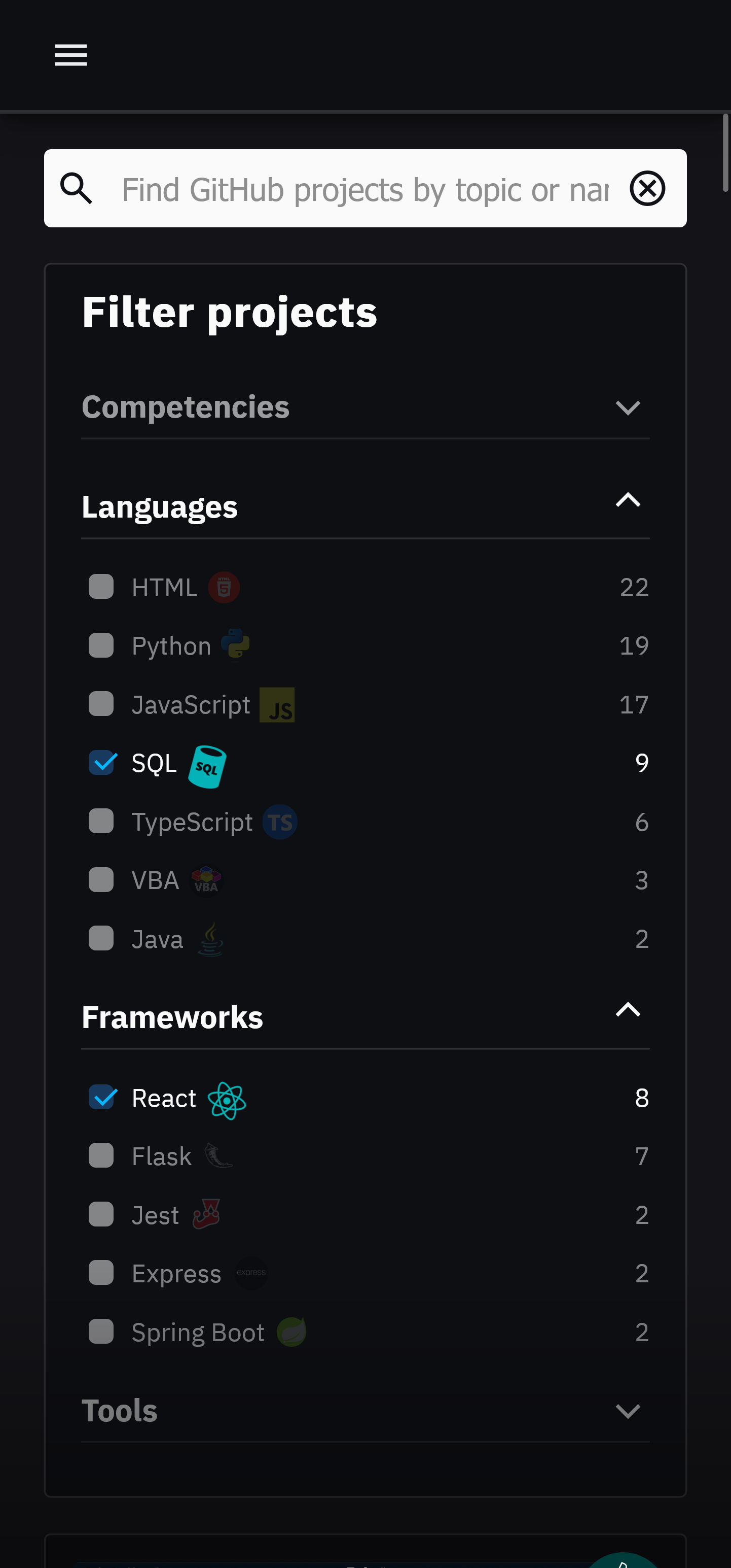
Originally, the design featured a word cloud based filtering interface wherein the user could click on a term to filter projects while incidentally comparing my experience with the term's corresponding skill-set. For example, a filter for "Competency" might show the terms "Web Development" and "Data Engineering" as filtering options, but the term "Web Development" might be visibly larger than the term "Data Engineering". Hovering over a term would then display the exact count of projects corresponding to the term. Said interface was eventually removed in place of a simple list, which then became a grid.
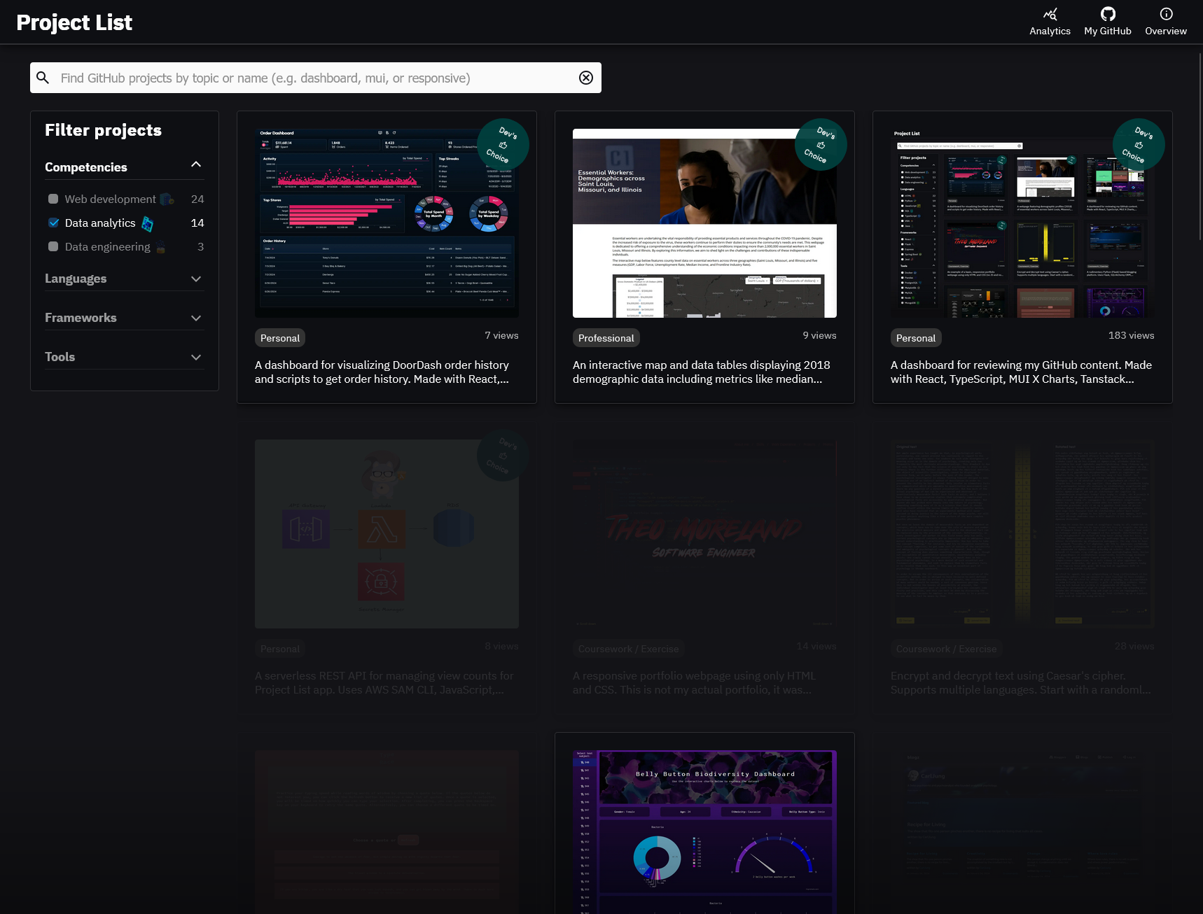
The resulting dashboard is similar to that of a portfolio in that it puts my project work on display, but there is a key distinction in that this application was designed to supplement a live conversation with management as opposed to being something that could effectively standalone. The dashboard aims to make a point of comparing skill-sets and relaying a breadth of experience first and foremost, with the option to do a deep dive into whatever project(s) pique the interest of the parties involved. Different from a portfolio, little effort was made to emphasize projects of particular quality, detail information about work experience, education, skills or interests, nor provide contact information.
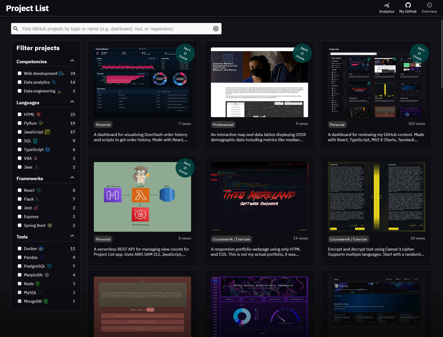
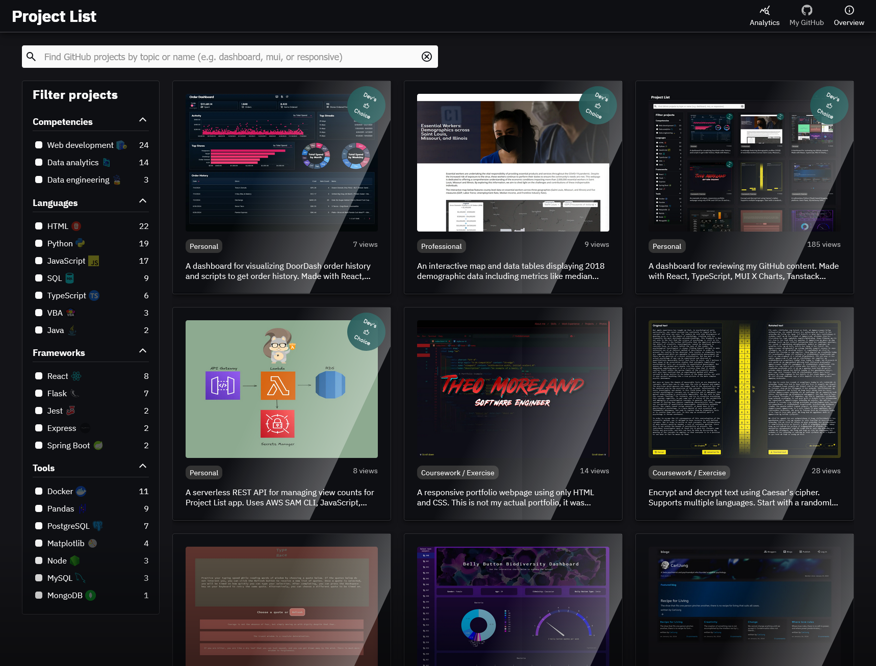
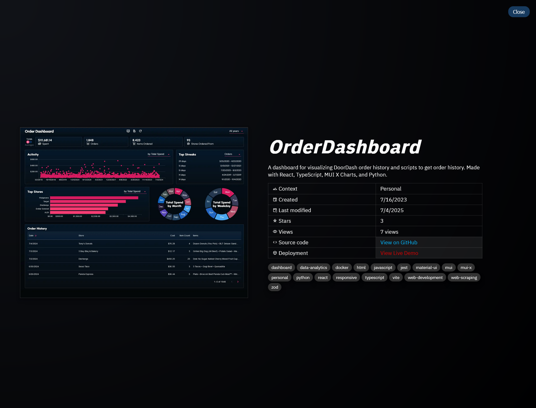
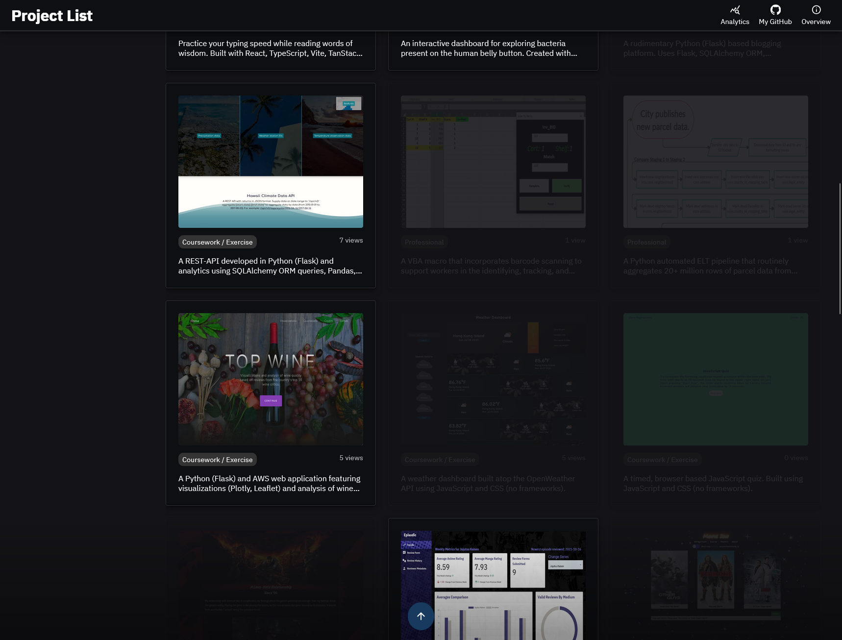
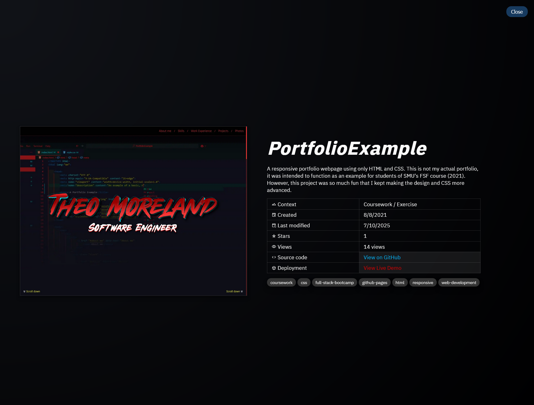
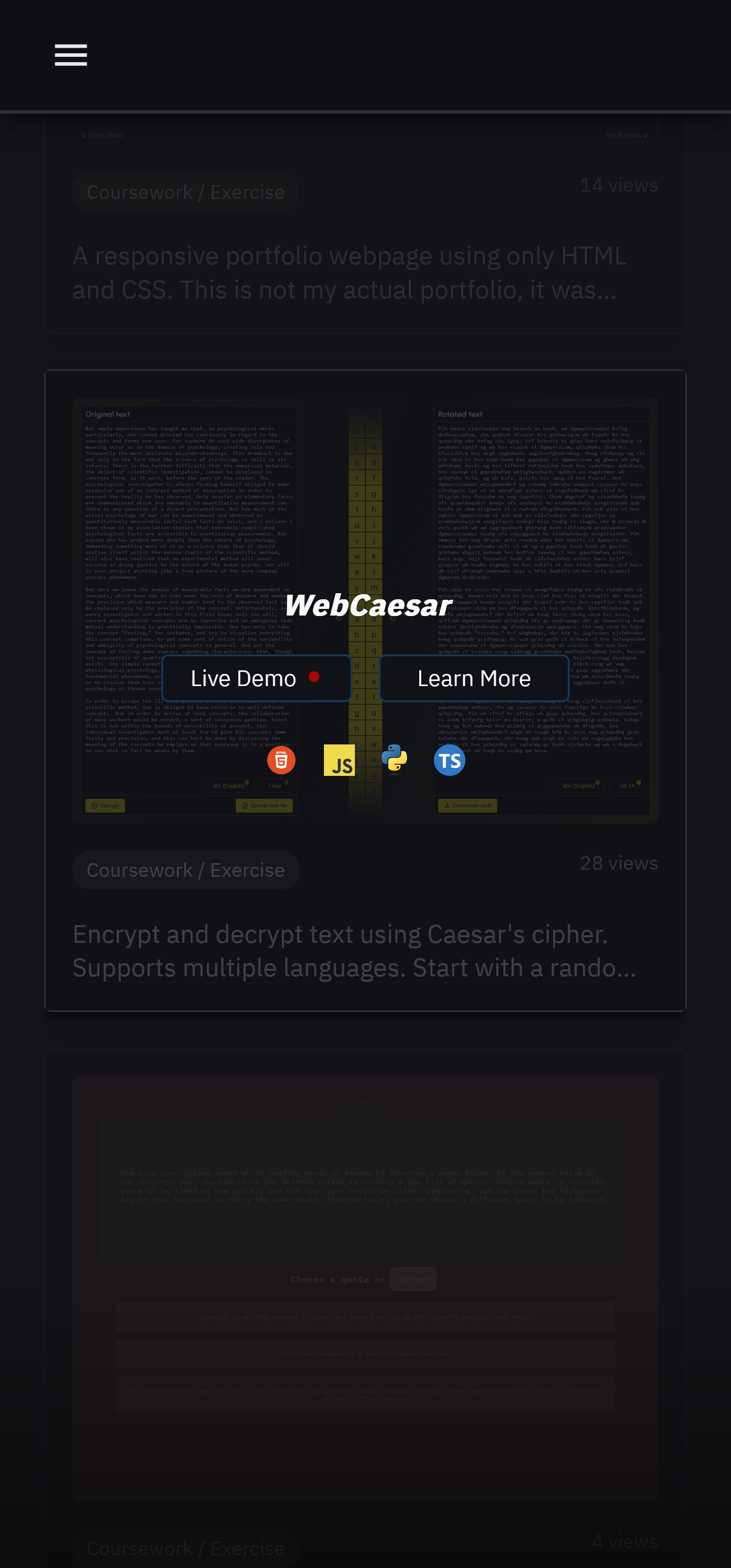
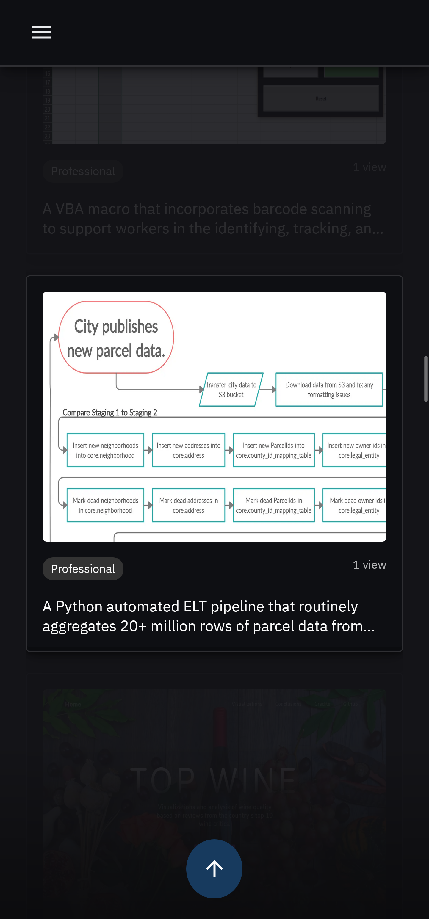
Each project is displayed as a thumbnail. Upon hovering over a thumbnail, a thumbnail overlay appears featuring the project's name and a list of icons representing the programming languages used.
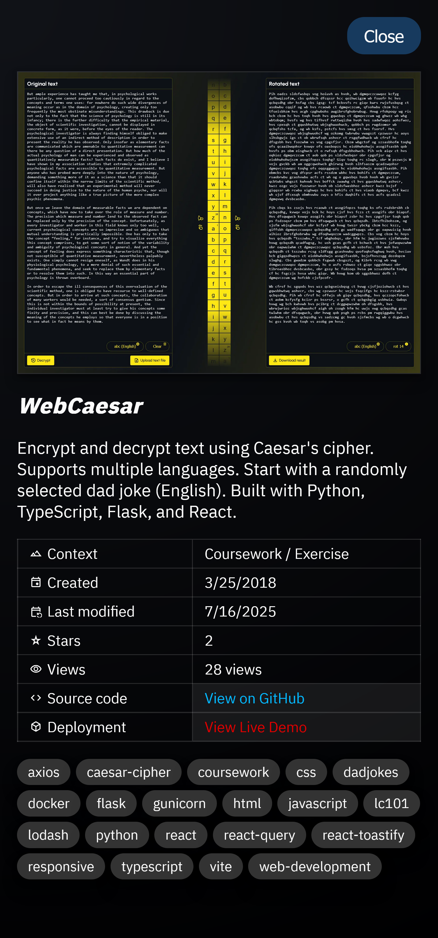
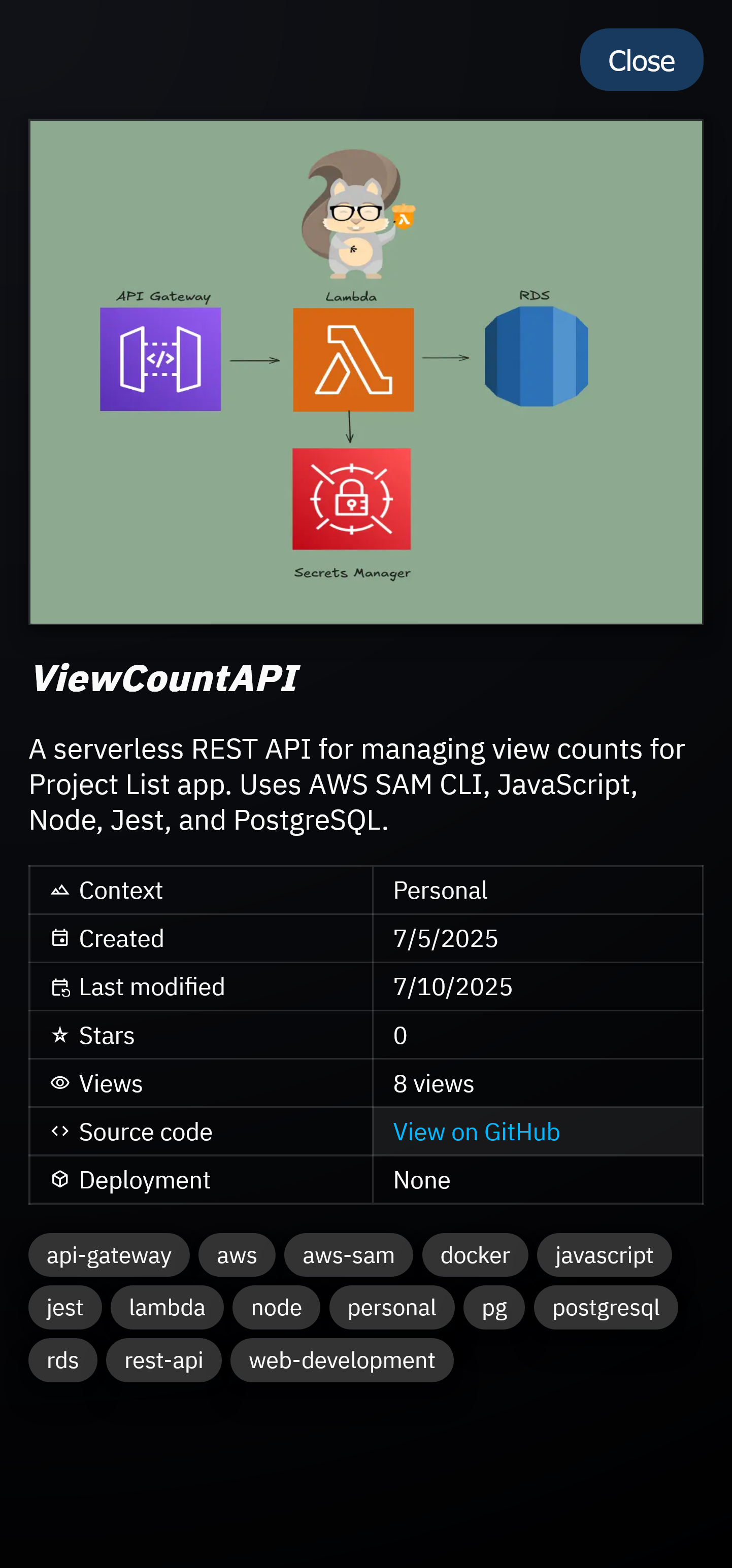
Additionally, each thumbnail overlay features a Learn More button, that when clicked, will display additional information about the project.
Conditionally, a Live Demo button appears if the project is actively hosted on a live server. Clicking the button will open a new tab featuring the web application.

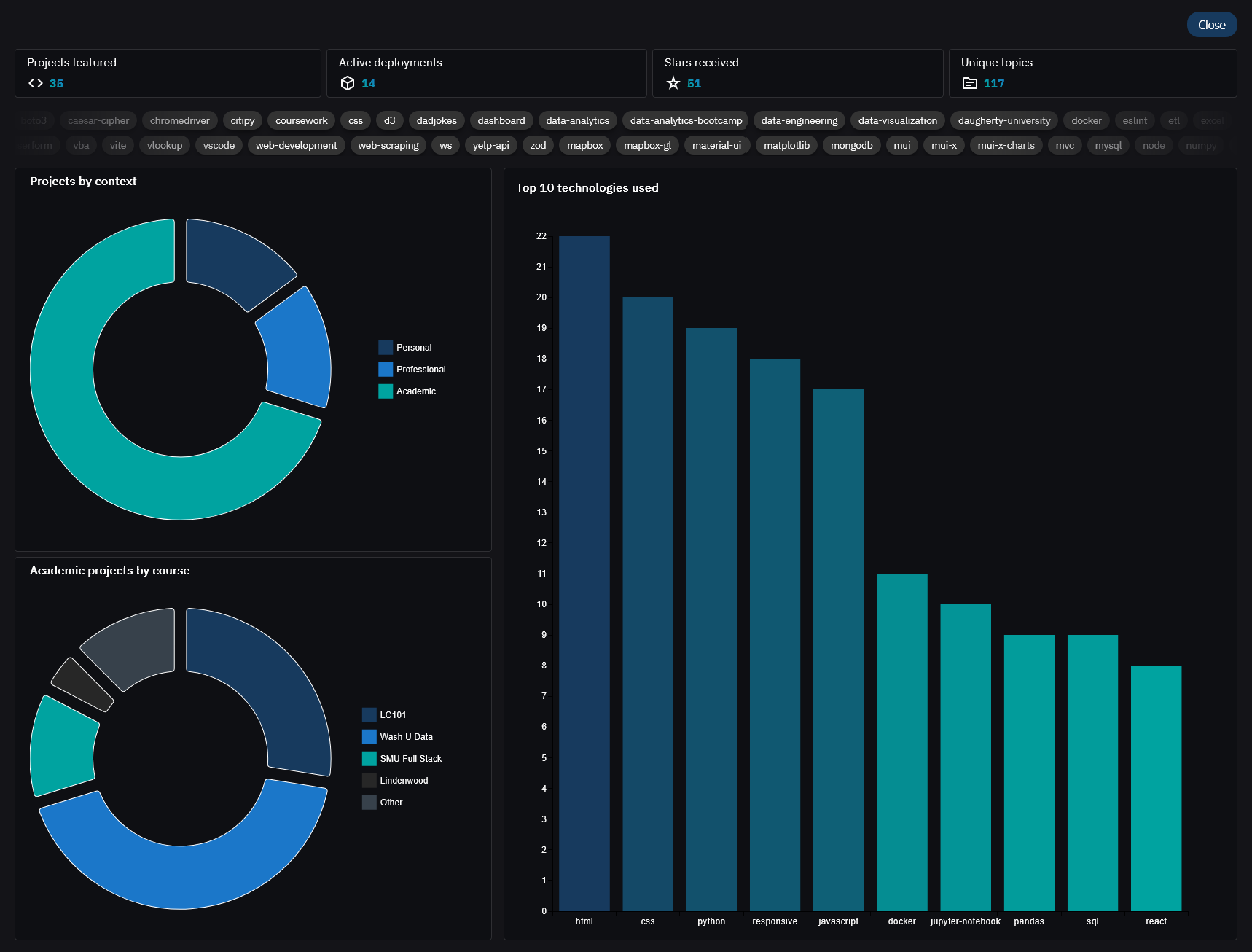
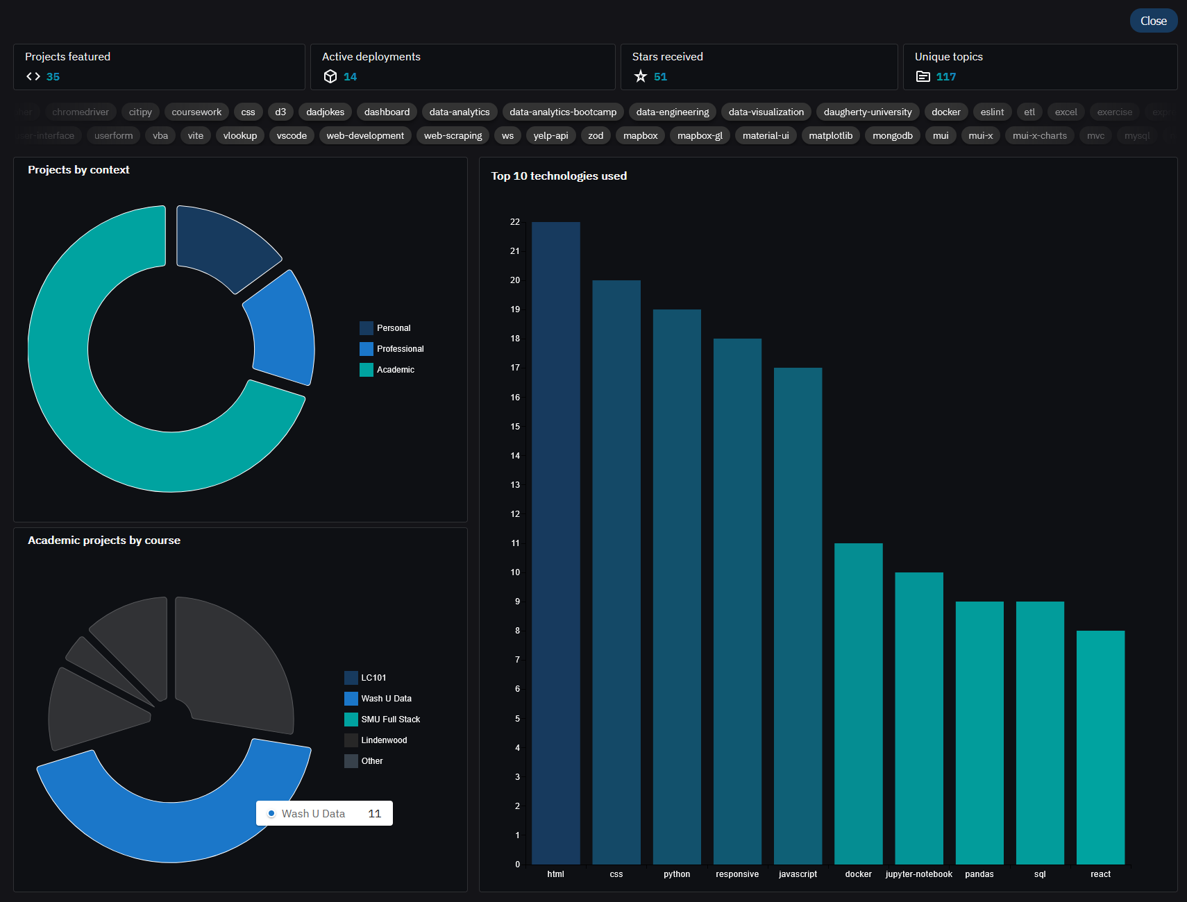
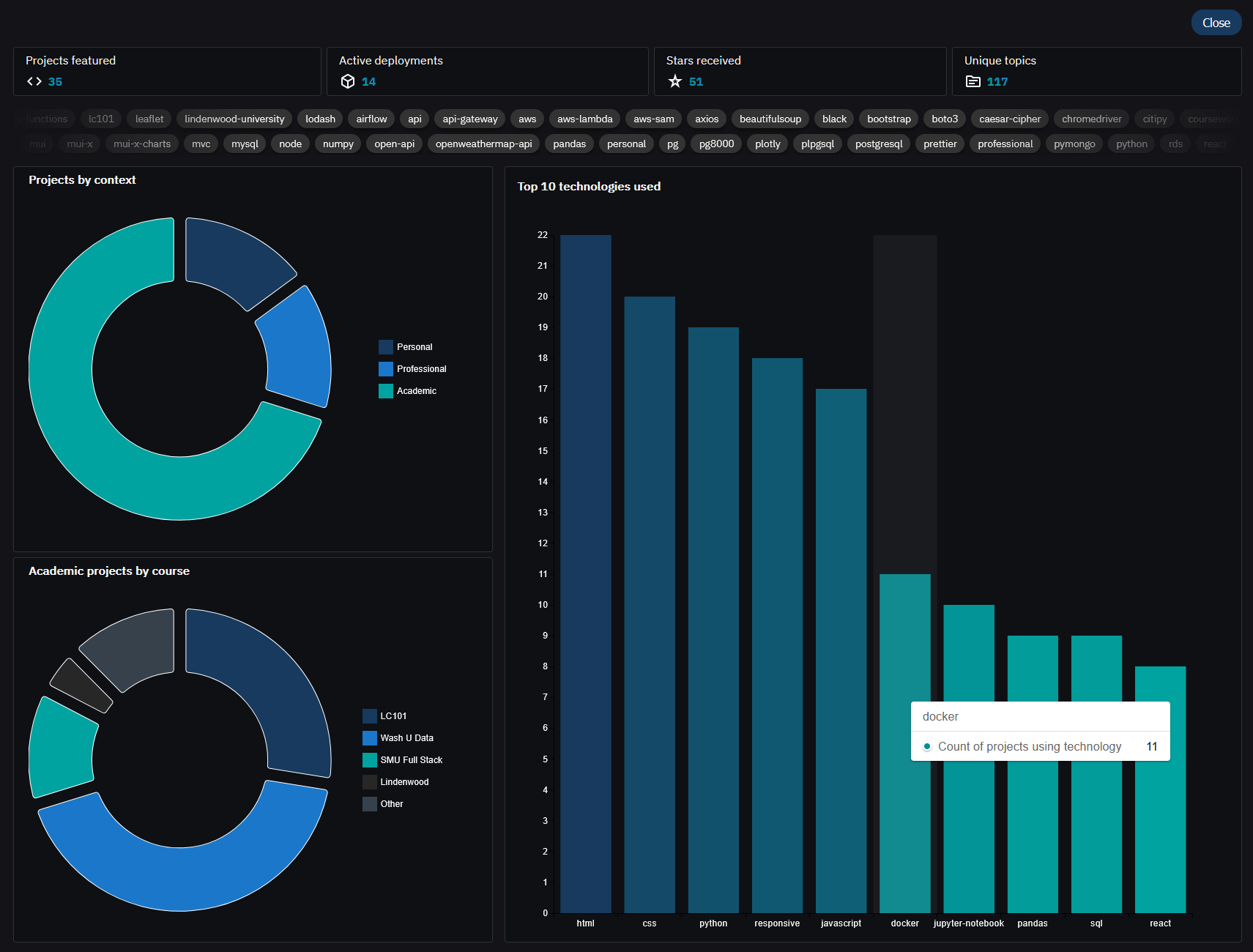
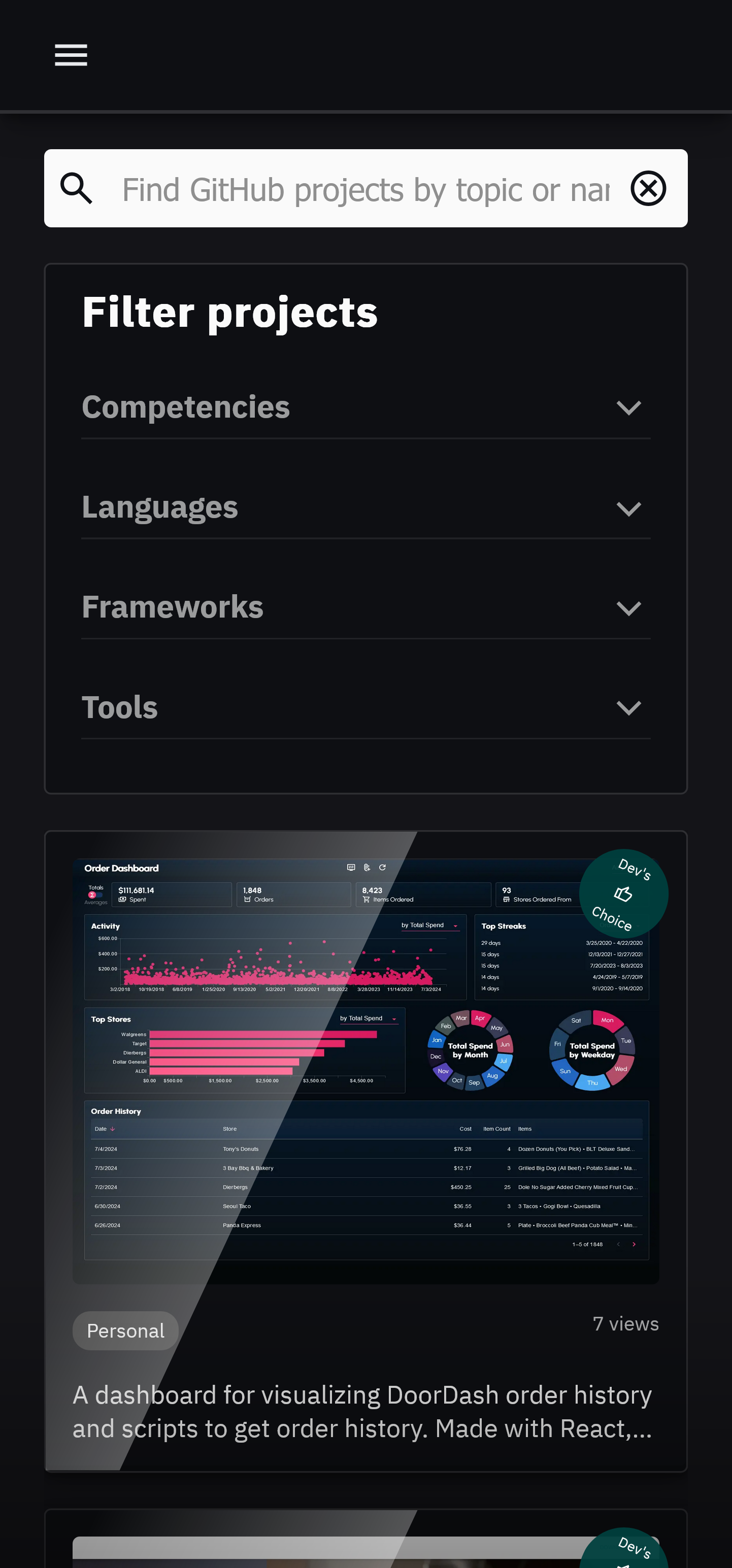
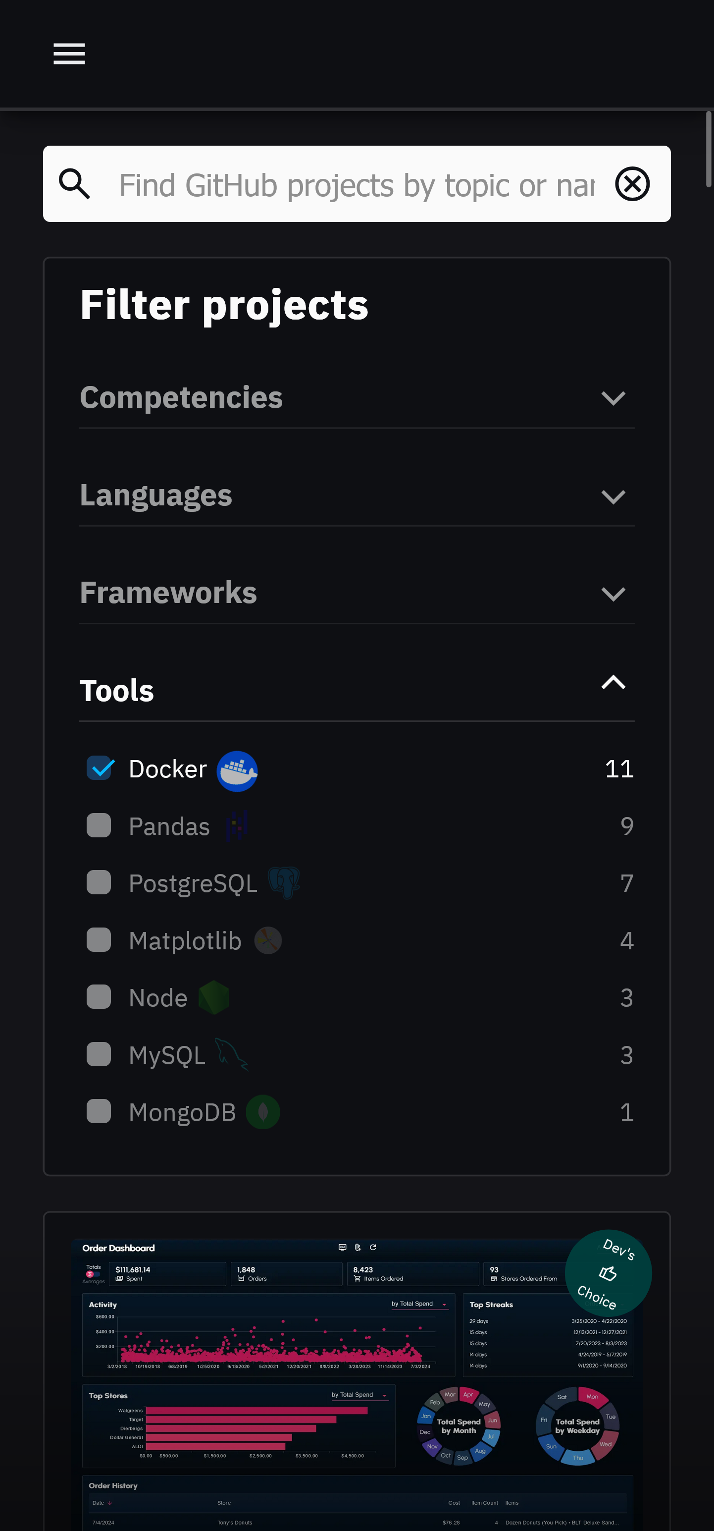
Technologies listed on the left panel can be clicked to filter projects by corresponding technology. The numbers displayed next to each technology represent the number of projects that utilize that technology.
Multiple filters can be applied simultaneously. Any project that does not feature any of the selected technologies will be hidden.
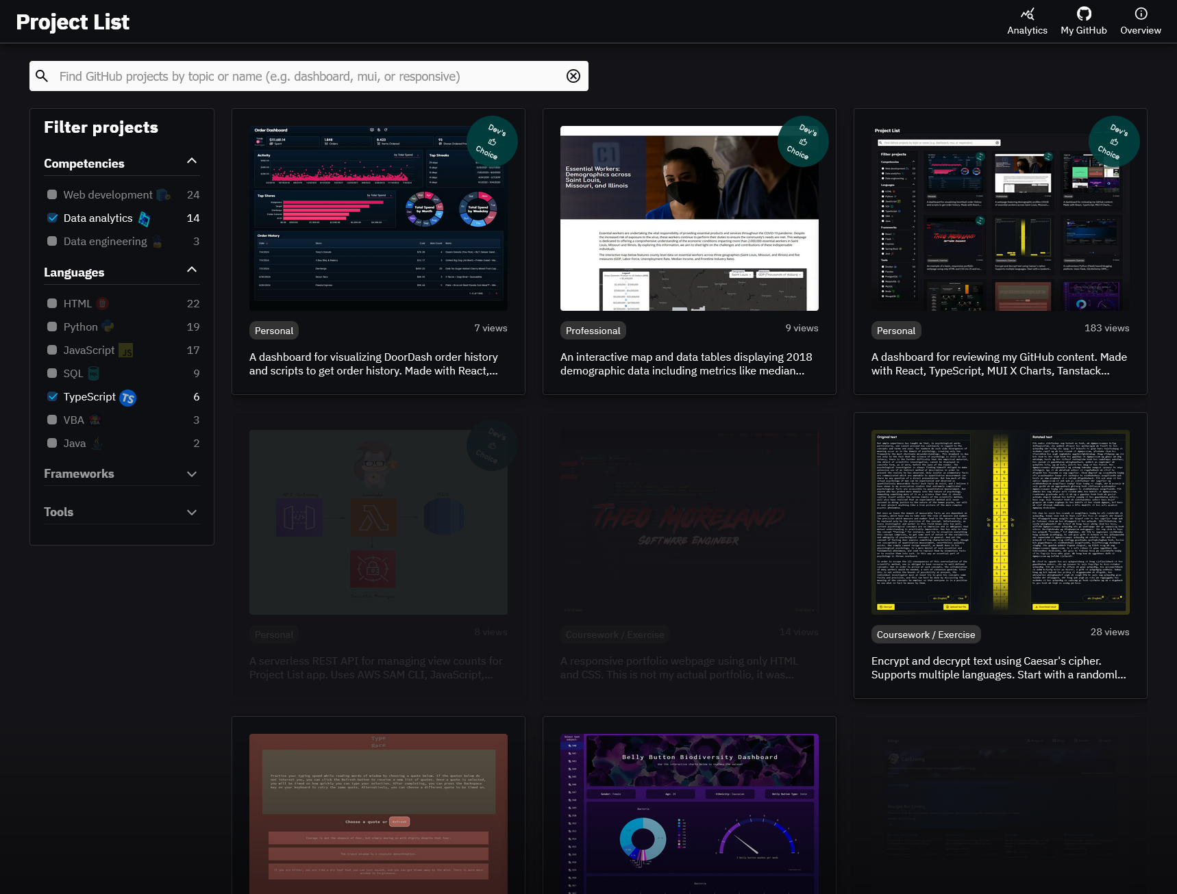
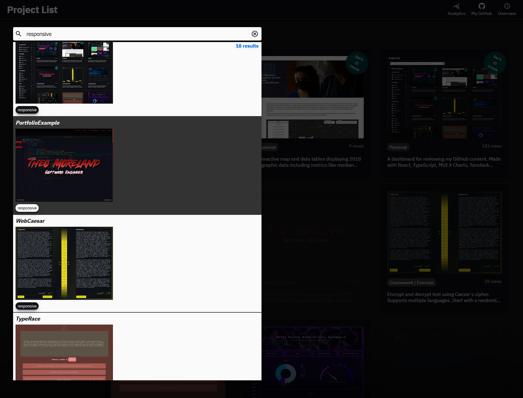
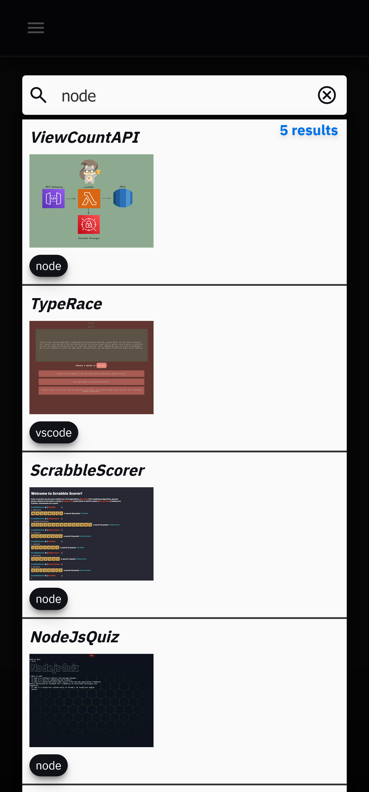
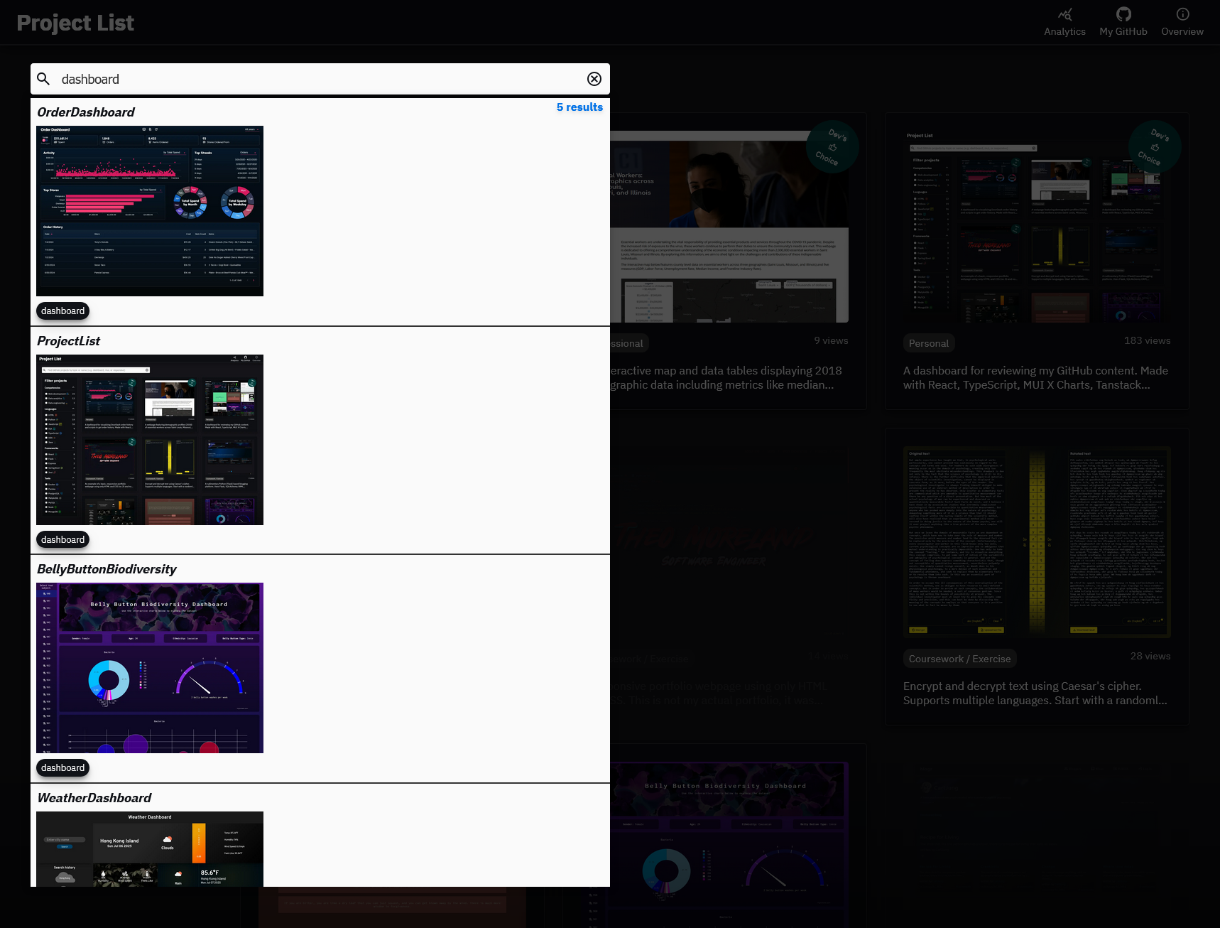
The search bar can be used to search for projects by name or GitHub topic.
Some examples include: dashboard responsive mui-x tanstack-react-query jupyter-notebook rest-api
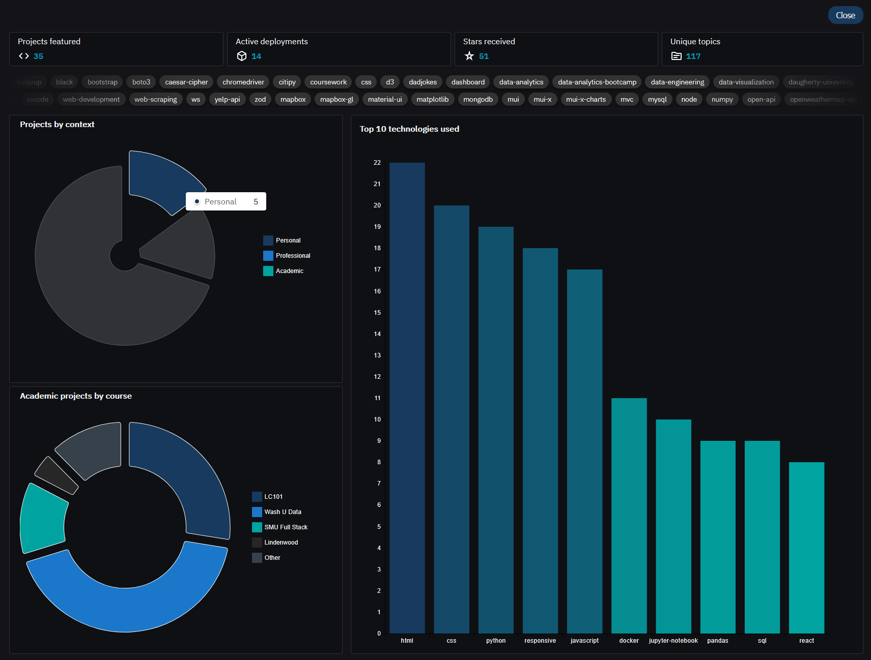
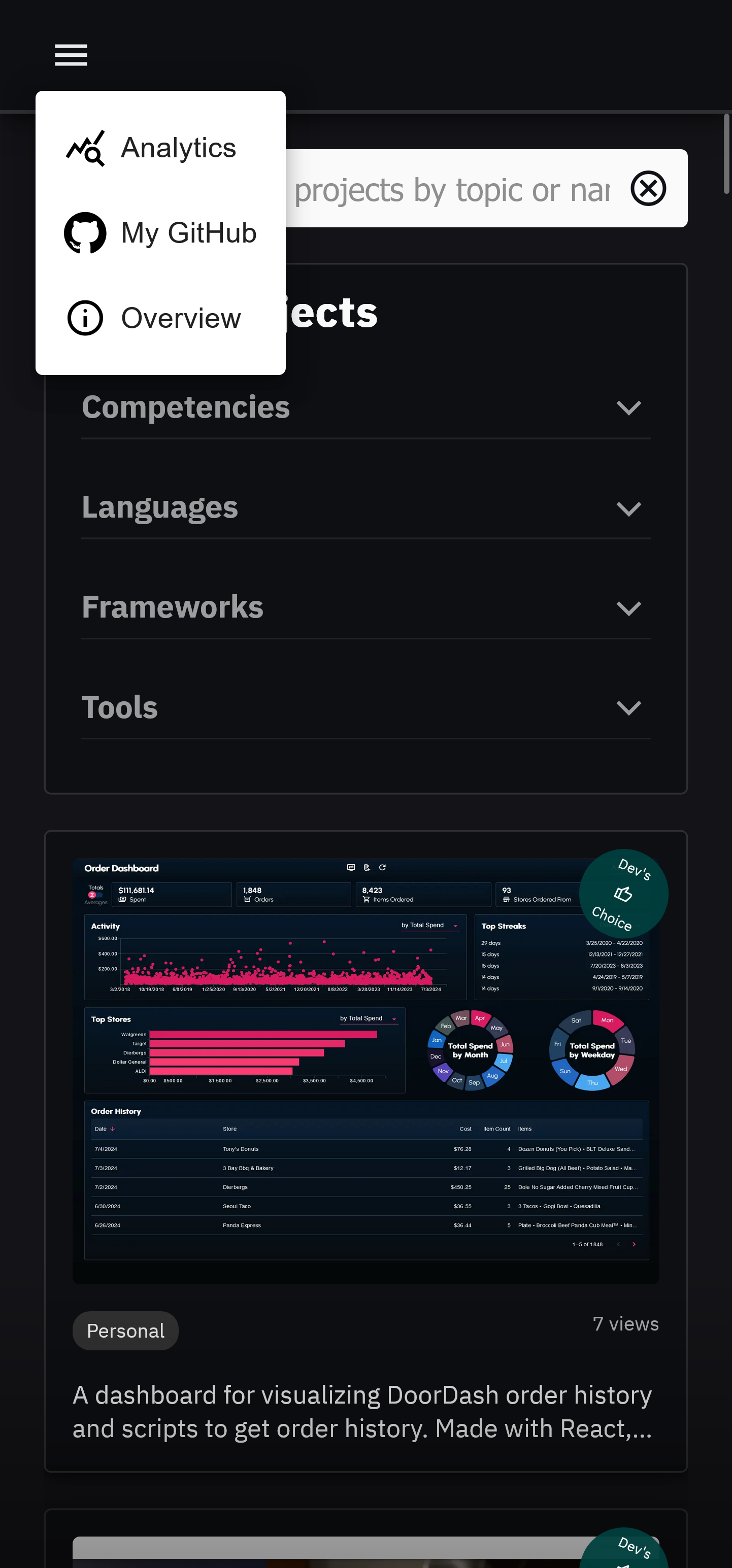
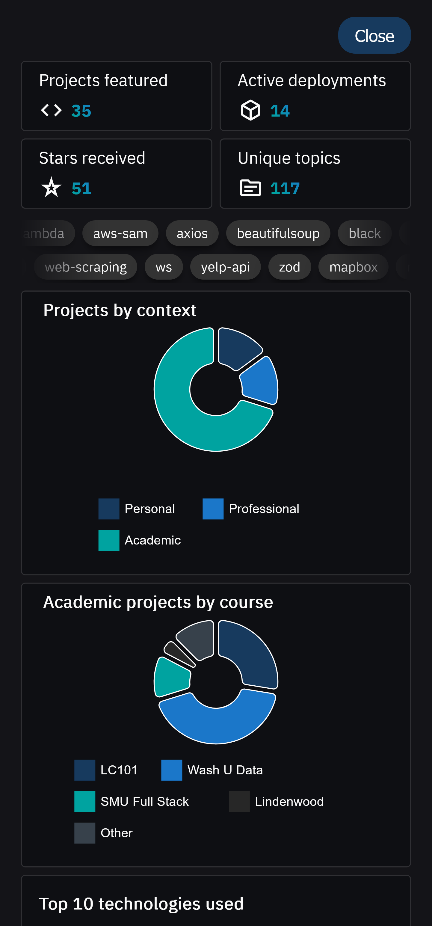
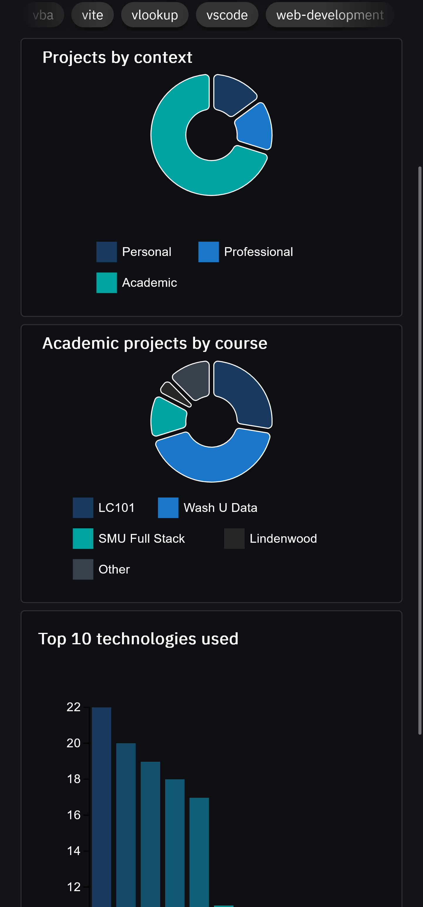
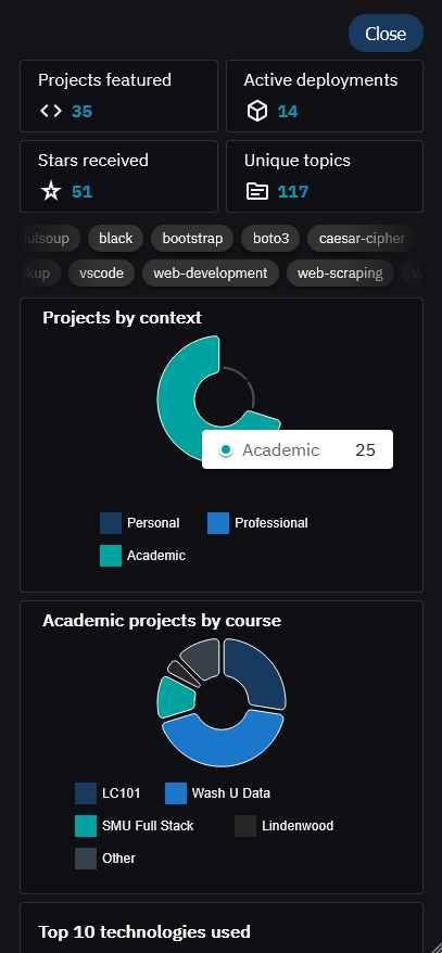
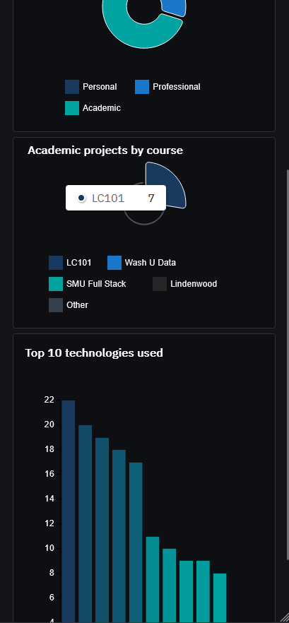
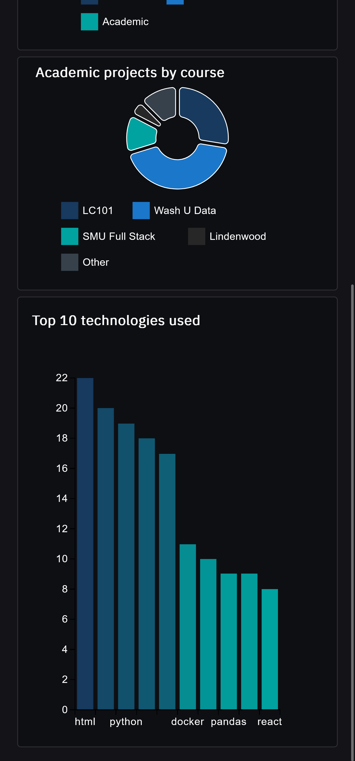
Clicking on the analytics icon in the navbar will display aggregate statistics about the projects featured.